What is a scatter plot?
A scatter plot is a set of points plotted on a coordinate plane that are not connected by any lines or curves. The graph below is a scatter plot.

What is a scatter plot used for?
Scatter plots are used to determine if there is a relationship between the x-values and y-values of a set of points. If a relationship exists you should be able to draw a line that shows the general path the points follow. In the graph below there is no line which can be drawn to show a path. Therefore there is no relationship between the x-values and y-values. We say that there is no correlation between the x-values and y-values in this situation.
Scatter plots with positive correlation
A positive correlation means that as the x-values get larger the y-values also get larger. In this situation the points follow a line that goes up from left to right. The scatter plot below shows a positive correlation between the x-values and y-values.
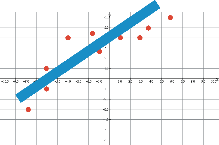
There is a general upward trend so there is positive correlation.
Scatter plots with negative correlation
A negative correlation means that as the x-values get larger the y-values get smaller. In this situation the points follow a line that goes down from left to right. The scatter plot below shows a negative correlation between the x-values and y-values.
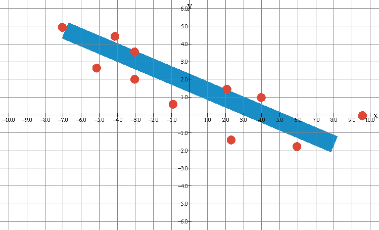
There is a general downward trend so there is negative correlation.
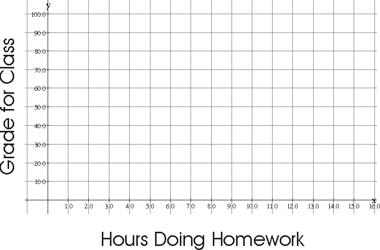
Example of a scatter plot
Use the points below to make a scatter plot to determine if there is a relationship between the hours spent doing homework each week (the x-values) and the grades (the y-values) earned by the students. (10,90), (9,95), (11, 98), (7,78), (6.5, 84), (4,55), (6,58), (4,68).
Scatter plot for the problem above
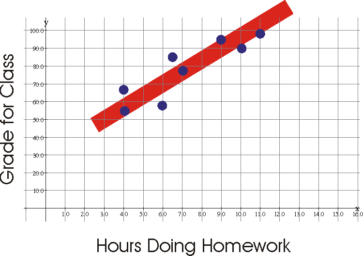
There is a general upward trend so there is positive correlation.